Translated by
Roberta HERRERA
Published
Jul 28, 2023
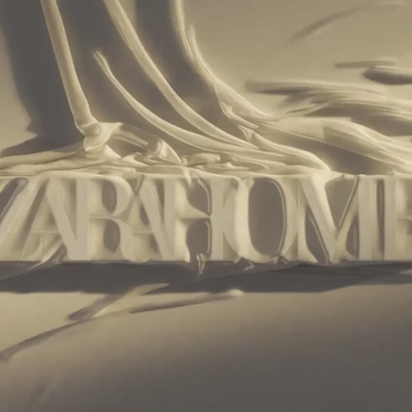
The Galician group is continuing its “rebranding” strategy for its brands, a process that has accelerated to mark the shift in the company’s new direction under the presidency of Marta Ortega. It does so by unveiling a new logo for its home and decor chain, Zara Home, which brings it closer to its older sister Zara, using the same style and typography as the logo introduced in 2019 and designed by Fabien Baron.
Zara, the flagship brand of Inditex, presented its new image four years ago, marking the second rebranding in its history. In 2010, the brand made slight changes to the logo, slightly spacing its letters. This latest modification involves the use of a Roman font with serifs, rounded shapes, and some overlapping when linking capital letters.
This new image for Zara Home will allow the brand to unify its visual identity with its older sister, Zara. It is a logical step in the trajectory of the decor chain, which, although still operates as an independent brand, has been integrated into Zara’s operations since March 2019. Since then, both chains have jointly presented their financial results.
Founded in 2003, Zara Home currently boasts a network of over 400 physical stores worldwide. Online, the brand is available in more than 200 markets and is notable for being the first brand in the group to venture into the digital realm.
In terms of positioning, Zara Home’s prices are slightly higher than the rest of the company’s brands, placing the brand in a more premium segment, developing a strategy of collaborations with niche brands or artists. This approach aligns with the guidelines set by Marta Ortega to elevate the image and prices of some brands within the conglomerate.
This evolution of the chain’s identity is not the first implemented by the Galician group in recent months. Just last April, the youth brand Bershka unveiled its new image, opting for an all-caps bold font. This move marked the brand’s first logo change in its history and celebrated its 25th anniversary.
Similarly, Pull&Bear, another brand under Inditex, presented its fourth image change, opting for a renewed store concept and geometric lines for its typography. Stradivarius introduced a new visual identity last year, and the entire Inditex group revealed a new corporate identity, featuring a black and minimalist logo.
In the first quarter of the fiscal year, Inditex recorded a 13% growth in sales, reaching 7.611 billion euros, while profits rose 54% to 1.168 billion euros.
Copyright © 2023 FashionNetwork.com All rights reserved.


